Three Essential Sections That Any Manufacturing Supplier Should Have on Their Website

Starting a website for your fabrication business or machine shop? At a minimum, there are really only three simple sections that you absolutely should have on your website to start gaining traction.
You can create a killer website having only these three items alone:
1. Focused Value Propositions
Your value proposition is ideally one sentence or less. It should state a problem and a solution. It should also convey your niche capability.
The key to a value proposition is focus and resolution. Ideally, you should highlight a single problem followed up by a niche capability solution. This should appear alone, front and center on your webpage. If your business focuses on one key capability, your entire website can be a single page, focused on this key target capability.
If you legitimately have multiple niche capabilities and value propositions, you should break these up into separate pages, each page should have a separate target value proposition listed front and center in the header. Your main navbar menu should have descriptive links to each individual page. This will help provide clarity and guidance for both your customer and for search engines.
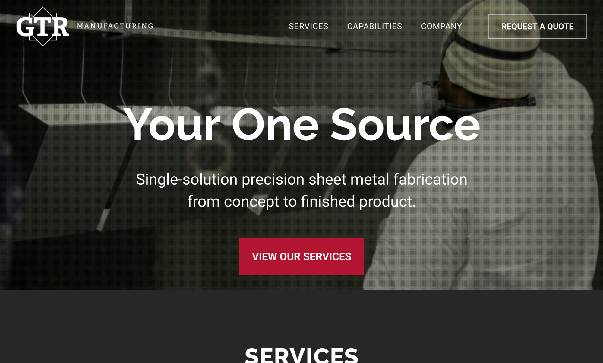
GTR Manufacturing provides an excellent example in their above the fold value proposition. Three simple words highlight the challenge of sourcing, and one sentence explains their single solution to precision sheet metal fabrication.
2. Calls To Action
A call to action is probably the most important element on your website, and yet is still so commonly overlooked. The call to action should be an easy button for your customer to continue in their journey, for example “Request A Quote,” or even “Submit An NDA.” Your website is a part of your sales funnel. The best workflow you can hope for is that your customer finds your page and immediately hits the call to action button.
Calls to action should be placed throughout your website to make it easy for your customer. You should have a fixed call to action that appears at the top of every page. You should also have calls to action at the footer of every page and consider adding them within content sections where appropriate.
One easy way you can offer a better user experience for both you and your customer is by using 3rd party integrations. KaizenDesk provides an interface for your customers to directly upload drawings for quote and purchase.
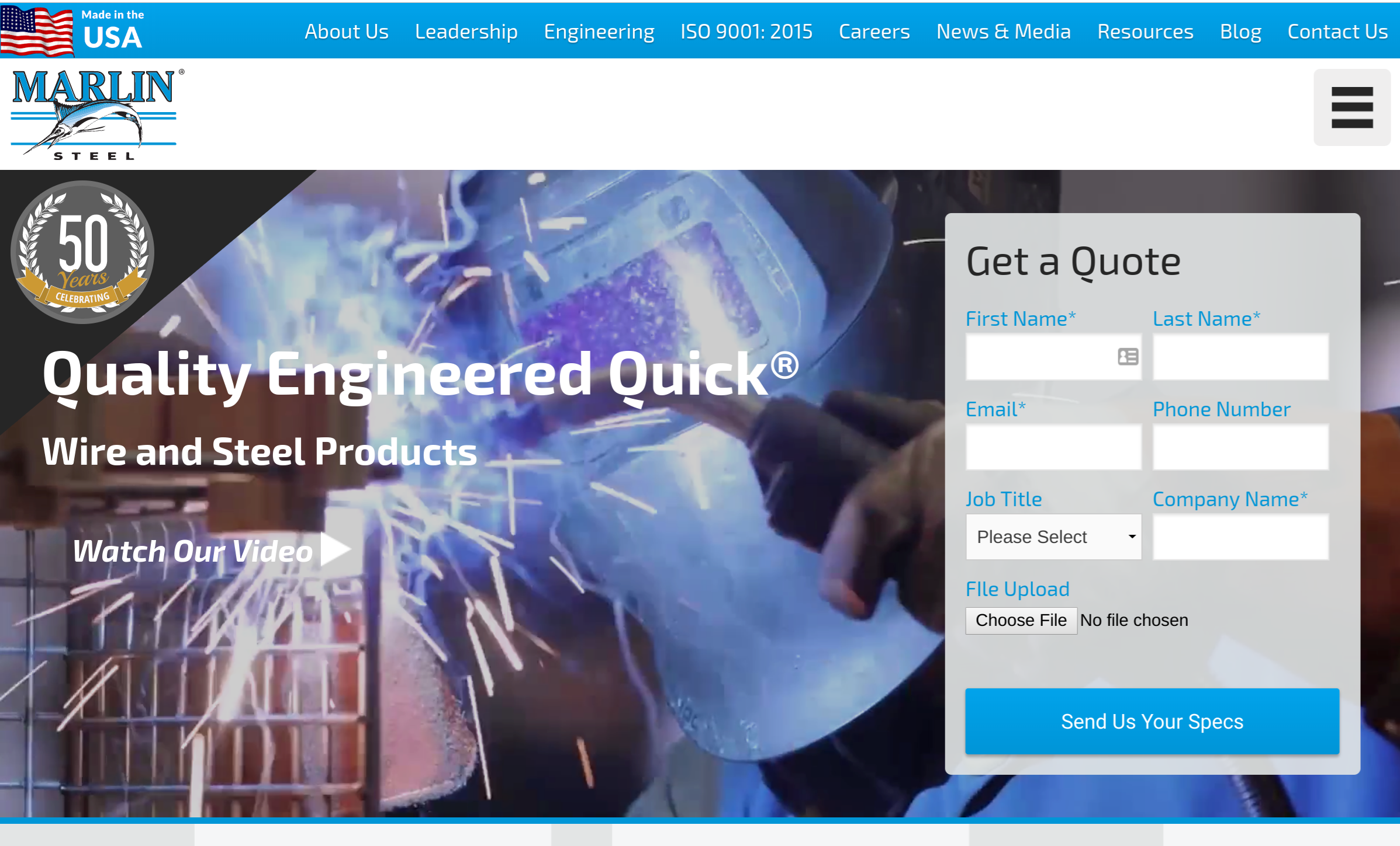
Marlin Steel's call to action is a prominent above the fold element of their site, making it super easy for their potential customers to get started with them.
3. Contact Information
This should be obvious and yet surprisingly overlooked. Simply having contact information on your website is not enough. Your contact info should be in the top right of every page, and ideally fixed as you scroll through the page. You should have as many options as appropriate to contact you - phone number, email, submit form, chat box, etc.
Often, your customers will not really read anything on your website anyways. Engineers will want to send a drawing and/or discuss technical questions. Few if any will attempt to search your website for an answer.
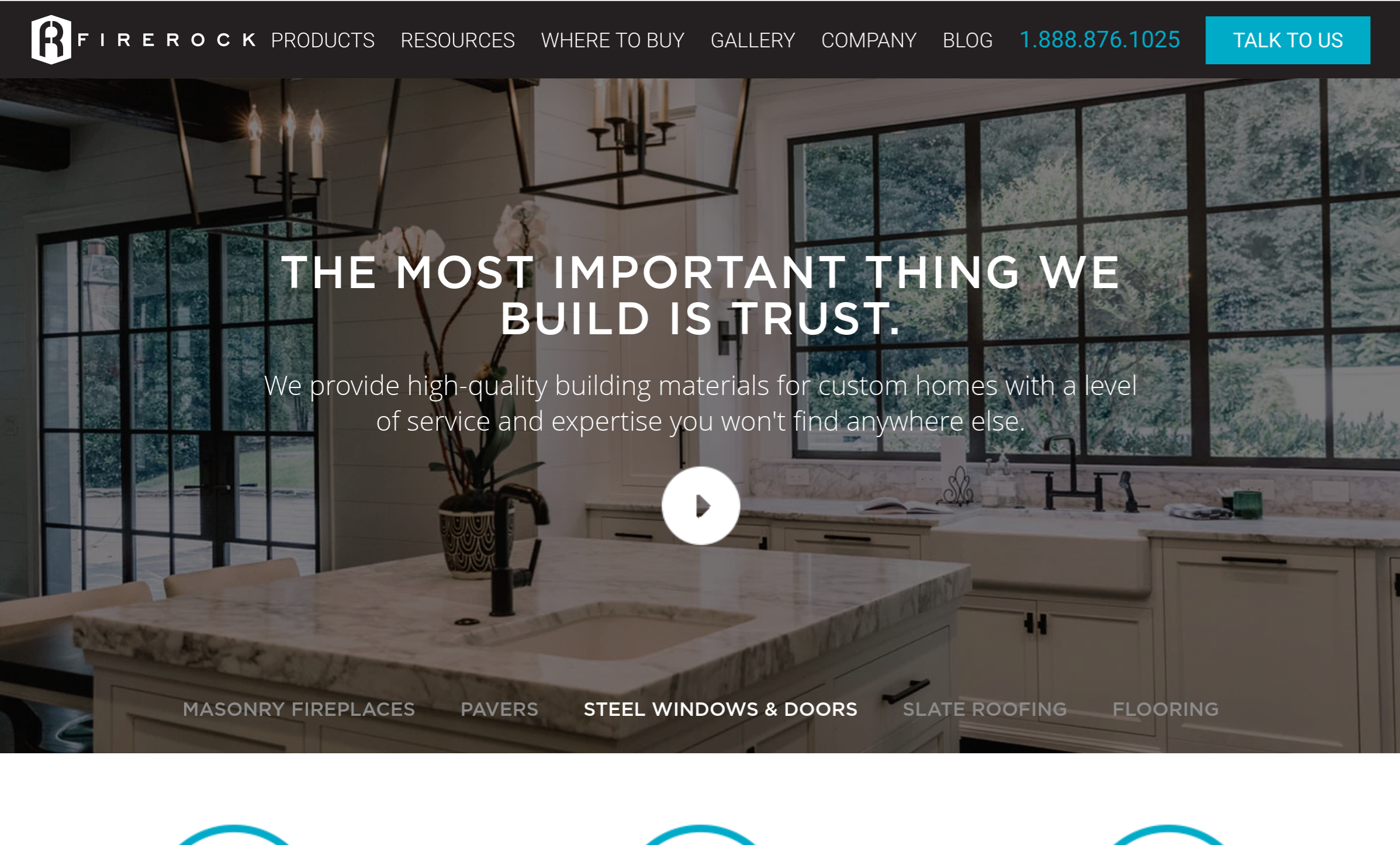
FireRock has their phone number and contact form in bright blue, stuck to the top of each page as you scroll, making it very easy to get in contact with them.
Time for a website upgrade? Chat with us at [email protected]!
Interested in more tips for growing leads online?
We love to help manufacturers grow their digital footprint. Signup for our email list and we'll send you our best tips for growing social leads online!
Subscribe to KaizenDesk
Get the latest posts delivered right to your inbox